Landing pages are a crucial part of any business website. Businesses across the globe have been moving to the online platform over the last few years and this shift has been further fuelled by the recent COVID-19 pandemic.
That being said, with more and more businesses across various industries arriving on the digital platform, the online market is growing increasingly competitive.
Businesses are paying attention to every aspect that can boost the results of their marketing efforts. A good Landing page stands to be one of those parts of a successful marketing strategy that can deliver the best ROI and help the marketing efforts of a business succeed.
So let’s look at the most important landing page design tips that can boost conversions for a business and help a business acquire maximum ROI.
Crucial Landing Page Design Tips to Increase Conversions and Ensure Success
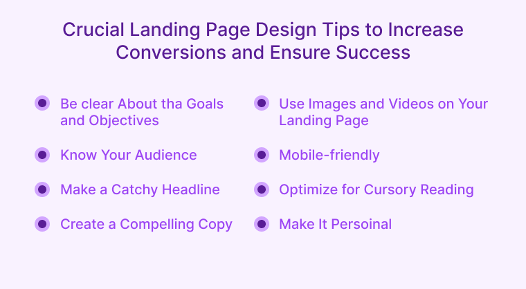
Landing pages can be a powerful tool for any business and when utilized appropriately, it can deliver high ROI and the best results. Although, the page must be appropriately designed and optimized to make an impact on the visitors and target audience to increase conversions.
Here are the most essential design tips that any marketing professional must keep in mind when designing the landing page.
Be Clear About the Goals and Objectives
Every landing page has to be sharply focused on a single business goal. This means that when you design a landing page you need to be very clear about this goal. The message of the landing page must be loud and clear and must reach the visitors efficiently.
Whether it is selling a product or asking the visitors to subscribe to a particular service, the message needs to be clear and in sync with the primary goal of the business’ landing page.
Also Read: Top UX Design Challenges and Their Solutions
Know Your Audience
The subjectivity of various marketing strategies is something that must be taken into account when designing a landing page. This means that you need to know who your audience is and how you will be able to successfully approach and influence them.
Your landing page needs to be relevant and useful for the visitors you want to convert. This can depend on geographical locations, age as well as other demographics, or any particular preference of the audience about a product or service you are offering.
For instance, if it is a clothing brand, you may want to create multiple landing pages based on the age of the audience or the area they live in, promoting different products appropriate for that group on different pages.
In fact, addressing buyer fears on the landing page can increase conversion rates by up to 80%. This was noted in an experiment conducted by Marcus Sheridan, a keynote speaker at Inbound 2019.
Make a Catchy Headline
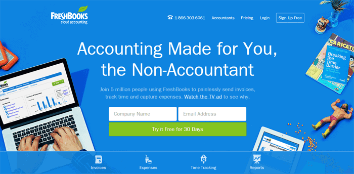
Your headline for the landing page is crucial for the success and effectiveness of the page. According to a study, 8 out of 10 people only read your headline, while only 2 out of 10 read the rest of the landing page.
That goes on to speak about how effective and important your headline can be on your landing page.
Create a Compelling Copy
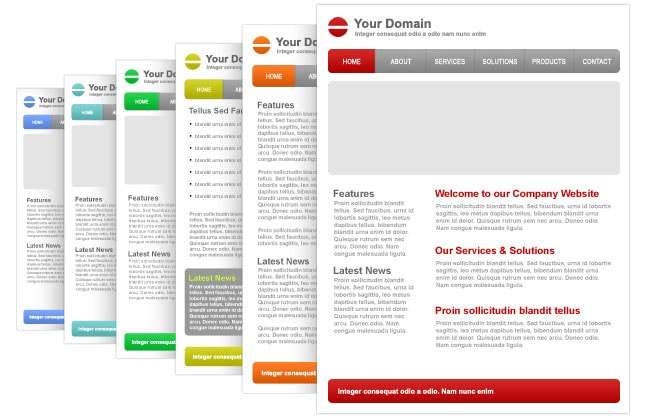
The importance of a compelling copy can never be denied in any form of a marketing campaign. Be it an email marketing campaign or your business landing page, a great copy can be a key element to success.
From the importance of a catchy headline discussed above to a concise and brand-oriented body for the copy as well as a personalized CTA, it can all contribute to better conversions. In fact, according to HubSpot, personalized CTAs convert 202% better than a normal CTA.
Not just the CTA, but as a part of a great copy, your body must be concise, informative, and useful and the footer must also be appropriately designed with all necessary information about the business and contact details.
Use Images and Videos on Your Landing Page
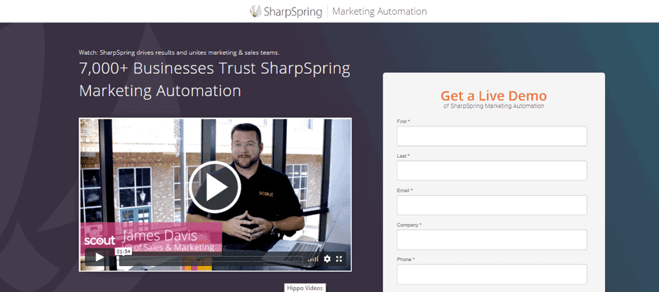 Texts can become boring at times, which is why landing pages must also include attractive images or videos. Be it a product image, pictures of the latest products, an eye-catchy background image, or any other engaging visual that can get the attention of the visitors, can be effectively used on a landing page.
Not just that, it has been observed through research that almost 50% of users look for videos related to a product before they visit a store. Quite naturally, 30% of top landing pages use video content.
Not just that, statistics suggest that relevant embedded video content increases conversions by over 86%, and 80% of video marketers said that video has directly increased sales.
Mobile-friendly
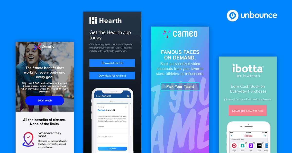
We live in the age of smartphones and most of our daily tasks including surfing products on the Internet for purchasing are done through our mobile phones.
This means that your landing page must necessarily be mobile-friendly. According to statistics, in today’s time, over 86% of the top landing pages are mobile-friendly.
Optimize for Cursory Reading
This might just be one of the most important landing page design tips to take note of, for any marketer. According to research by UX Myths, landing pages that are designed for cursory reading have more chances to be read and are more likely to increase conversions.
Modern-day Internet users have a very short attention span and most online users do not read every word on a webpage, they basically scan to get an idea. Cursory reading means scanning a page.
This is where your landing page can make an impact with the use of bullet points, short paragraphs, and sentences in the active voice to enable readers to scan the landing page.
Make It Personal
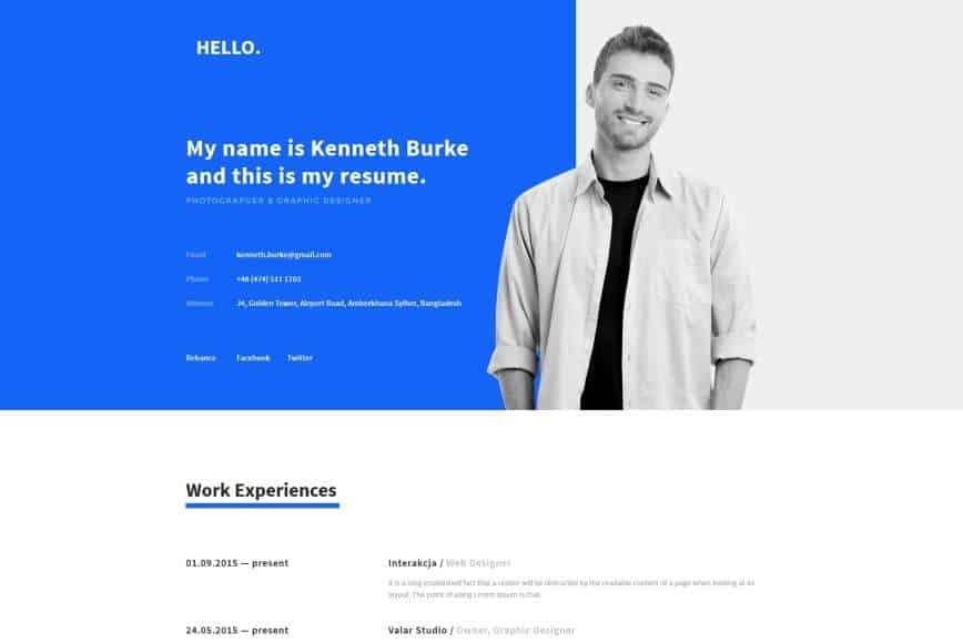
As human beings, we crave personal connections with other people. A landing page that helps the audience to create a connection with the brand by using images consisting of real-life human beings can be a good strategy. You may want to avoid the use of stock photos and use real-life photos of the business.
Real photos are genuine and naturally more appealing. According to statistics, over 44% of SaaS landing page images feature people.
Final Thoughts
While there are a lot of things to take care of in the course of landing page optimization, these simple yet highly effective landing page design tips listed above can be an effective way to increase conversions.
As a marketer or business owner, anyone would like to enhance conversions for their business. With the right design for your landing page, you can successfully do that without increasing the ROI and business success!


