


A simple “Top 10” list won’t tell you what actually matters same old names being thrown around without any real depth. What leaders really need to be asking is: Which Vue component library is going to work best for our product, our environment and future direction?
Vue.js is a big player in the JavaScript MVC framework game and has around 28.75% market share to its name that puts it second among competing frameworks. Getting the right choice depends on whether it’s Vue 3 compatible, styling, accessibility, performance and maintenance.
Full featured libraries can accelerate enterprise development, while headless options provide teams with greater design control. This guide evaluates leading Vue component libraries and Vue UI frameworks and flags legacy choices that introduce risk for new Vue 3 projects.
Why a Vue Component Library is a Big Deal for your Business Critical Apps
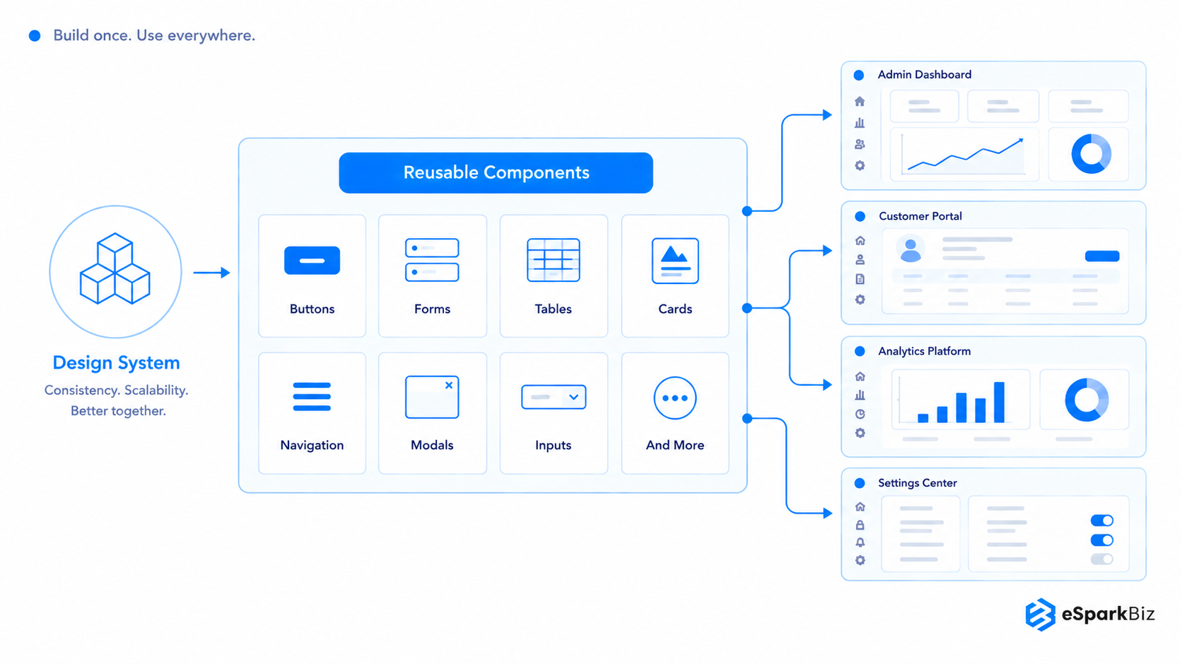
A Vue component library is basically a set of pre-built UI elements- buttons, forms, tables, nav tools that teams can use to build interfaces faster and keep the design consistent across the whole application.
Standardising like this improves accessibility and gets your products delivered efficiently, but for enterprise teams, the choice is more than just about speed. It influences:
- Development speed and standardisation – fewer components built from scratch, faster release cycles
- Consistent design language – you get a unified look and feel across loads of screens
- Accessibility and governance – you’re not going to get away from your compliance obligations that easily
- Performance and maintainability – bundle size and update frequency can affect how healthy and easy to maintain an app stays over time.
- Long-term dependency risk – how stable is the maintainer and how strong is the community backing – you need to be thinking about this stuff for the long haul
New to the framework itself? Read why teams choose Vue.js for modern web development first.
What Tech Leaders Should Check Before Picking a Vue Library
We evaluated 20+ libraries against six criteria, then shortlisted the selections below based on Vue 3 support, accessibility and long-term maintenance.
Vue 3 and ecosystem compatibility
This is the first filter to apply libraries that don’t fully support Vue 3 introduce upgrade debt and ones with poor ecosystem alignment will create friction across existing tooling.
Accessibility
For anyone in a heavily regulated industry or working with government clients, accessibility isn’t something you should have to think twice about – it’s a legal requirement. And if a library doesn’t have built-in support for WCAG, you need to steer clear.
Theming and Design Systems
Teams often ask for a Vue component library Tailwind setup, and it works best with libraries built for it. PrimeVue in unstyled mode and Reka UI both pair well with Tailwind.
PrimeVue gives you ready-made components to style with utility classes, while Reka UI gives you accessible primitives with zero styling.
Most teams will eventually want more than what a library offers by default.
| Finding the Right Approach | What All This Means for Enterprises |
| Design tokens | The fastest route to brand alignment with minimal changes |
| SCSS/CSS variables | Moderate effort, familiar to most front end teams |
| Unstyled/headless | Full control, but requires a dedicated design and engineering team |
Performance
The size of your bundle and how efficiently your components render has a direct impact on load times – and at enterprise scale with thousands of users, it all adds up and can even start to impact your infrastructure costs.
For teams already running Vue.js in production, our Vue.js best practices guide for product delivery provides information on rendering and code splitting practices, regardless of which library you choose.
Maintenance and Support
Here’s what to check before committing.
| Risk Area | Lower Risk | Enterprise Warning |
| Maintenance | Active maintainers, regular releases | Stalled releases, single maintainer |
| Compatibility | Timely Vue updates | Delayed major-version support |
| Security & Support | Clear security process, defined support | Limited visibility, community-only support |
| Exit Strategy | Incremental replacement | Deep application coupling |
Licensing and TCO
TCO (total cost of ownership) is about more than just the licence fee – here’s what CXOs should be evaluating.
| TCO Factor | What Enterprises Should Evaluate |
| Licensing | Subscription, licensing and support costs |
| Adoption | Training and onboarding effort |
| Customization | Effort to align with the design system |
| Maintenance | Upgrades, regressions and compatibility |
| Support | Internal support or vendor-backed support |
| Exit Cost | Effort required to replace the library |
Vue Component Libraries Compared: Technical Depth Meets Business Fit
Compare leading Vue component libraries and UI frameworks by comparing features, theming flexibility, accessibility, framework compatibility, styling options, and enterprise readiness to identify the best fit for your project.
| Sr. No. | Vue Component Library | GitHub Stars* | npm Weekly Downloads* | Approx. Components | First Released | Theming Approach | Best For | Vue 3 | SSR/Nuxt | Styling | Accessibility | Enterprise Support | License |
| 1 | Vuetify | 41k | 354,208 | 90+ | 2016 | SASS variables, runtime theming | Enterprise dashboards, admin portals | Yes | Yes | Material Design | Moderate, manual checks needed on complex components | Community plus sponsors | MIT |
| 2 | PrimeVue | 14.4k | 254,029 | 90+ | 2017 | Design tokens, styled/unstyled modes | Data-heavy business applications, CRM/ERP | Yes | Yes, Nuxt | Styled / Unstyled | Strong, built-in ARIA support | PrimeTek Informatics | MIT |
| 3 | Element Plus | 27.8k | 260,757 | 80+ | 2020 | CSS variables, SCSS | Admin panels, operations software | Yes | Yes, Nuxt | Themeable | Moderate | Community (Ele.me origin) | MIT |
| 4 | Quasar | 27.2k | 148,044 | 70+ | 2015 | SCSS variables, CLI theming | Cross-platform web, mobile, desktop apps | Yes | Yes | Material-oriented, customizable | Moderate | Quasar Framework Team | MIT |
| 5 | Naive UI | 18.6k | 63,856 | 80+ | 2020 | JS based theme overrides | TypeScript-heavy SaaS, internal dashboards | Yes | Nuxt compatible | Themeable, CSS-in-JS | Limited documentation | Single maintainer (07akioni) | MIT |
| 6 | Ant Design Vue | 21.7k | 54,175 | 60+ | 2018 | Less variables, design tokens | Enterprise portals, business management systems | Yes | Yes | Ant Design system | Moderate | vueComponent org | MIT |
| 7 | TDesign Vue Next | 2.2k | 18,273 | 70+ | 2021 | CSS variables | Large-scale business platforms | Yes | Yes | Enterprise design system | Limited documentation | Tencent | MIT |
| 8 | Shadcn-vue | 10.7k | 38,965 | 70+ | 2023 | CSS variables and Tailwind CSS | Custom design systems and full code ownership | Yes | Yes, with setup | Tailwind CSS | Built-in accessibility via Reka UI | Community support | MIT |
| 9 | Arco Design Vue | 3.1k | 11,652 | 60+ | 2021 | Design tokens | Internal dashboards, data-heavy apps | Yes | Yes | Design system, tokens | Limited documentation | ByteDance | MIT |
| 10 | Reka UI (formerly Radix Vue) | 6.9k | 821,644 | 40 to 50 | 2023 (as Radix Vue) | Fully unstyled, primitives | Custom design systems, branded SaaS | Yes | Yes, Nuxt-oriented | Headless, unstyled | Strong, accessibility-first primitives | Community | MIT |
*GitHub stars and weekly npm downloads change continuously. Data reviewed in October 2026 indicates adoption and usage, not production quality or scalability.
Comprehensive Vue 3 Component Libraries – Ready-to-Use Design Systems
Building a whole new interface from scratch can be a real pain and it can take longer, getting bogged down in inconsistent design, which is why using a comprehensive Vue library can save your team weeks of work.
What these libraries offer:
- Pre-built styling & layouts, plus design systems that are pretty much ready to use
- No more tedious development cycles
- And by default, user get a consistent polished-looking app
Where the trade off comes in:
- Customizing beyond the library’s built in design language often takes extra effort
- Visual identity tends to follow the library’s style rather than a fully custom brand look
1. Vuetify
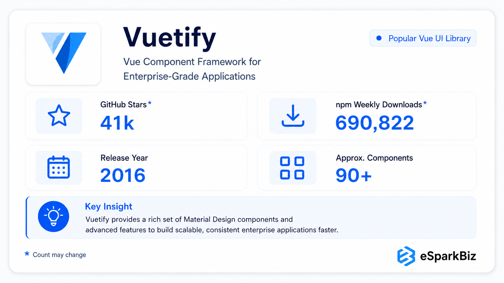
Vuetify is a great choice for teams who want to tap into the Material Design aesthetic, get a wide range of components and a solid visual foundation without building the design system from scratch.
Ideally suited for developers who don’t have a big design team to call on or who need to get their product up and running fast without having to build the whole design system from the ground up
Key Features
- Material Design components
- Large UI component library
- Built for business applications
- Consistent design system
Ideal For
- Small teams that lack design resources
- Fast product development process
- Implements Material Design approach
Enterprise strengths
- Mature ecosystem
- Consistent design
- Faster development
Considerations
- Similar-looking interfaces
- Limited deep customization
- Less suited for unique designs
2. PrimeVue
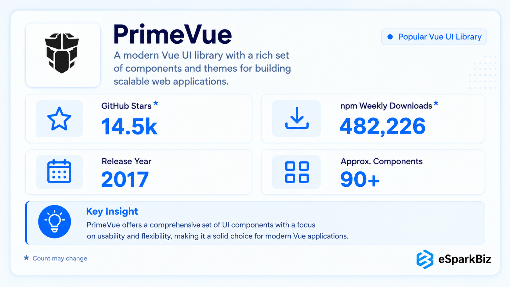
PrimeVue is geared towards applications where data is the main event. With its user-friendly features and reliable components, it’s perfect for Vue.js development teams who are working on complicated internal applications that just need to work.
Use PrimeVue’s unstyled mode and style with Tailwind, or keep PrimeVue’s theme and use Tailwind only for layout and spacing.
Key Features
- Advanced data table capabilities
- Form and data entry components
- Enterprise oriented UI patterns
- Support for complex workflows
Ideal For
- Pre-built or flat themes
- Long and complex workflow
- Analytics applications
Enterprise Advantages
- Sturdy data interface support
- Broad component coverage
- Useful for complex business applications
Key Considerations
- Large feature set requires evaluation
- Architecture and release cadence need review
- May be excessive for simple applications
3. Element Plus
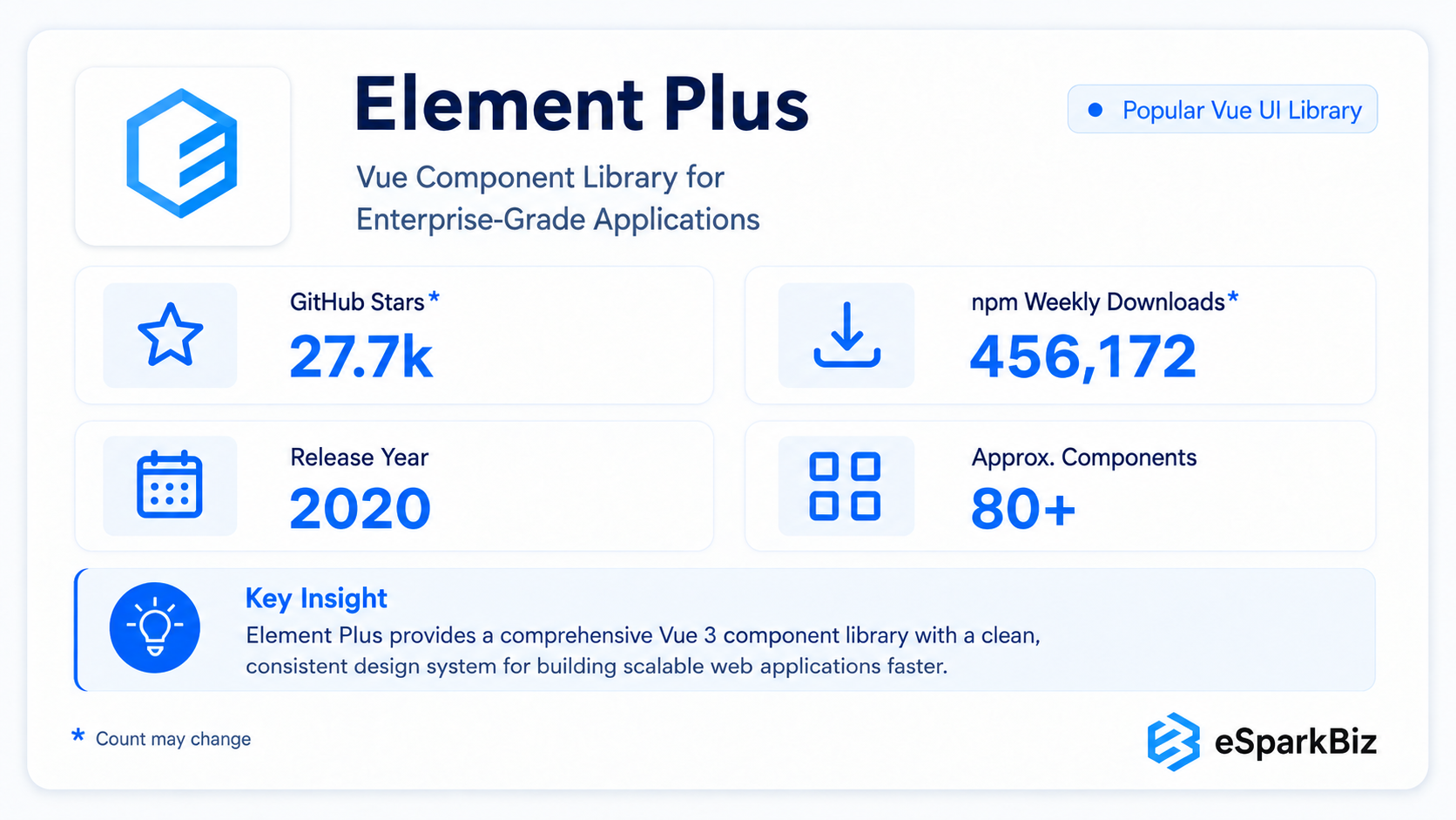
Element Plus is a practical fit for teams building admin panels, ERP systems, or operational dashboards – basically anywhere delivery speed is key and fine-tuning the visuals or heavy customization requirements isn’t a top priority.
Key Features
- TypeScript support
- Structured business UI components
- Familiar Element UI patterns
Ideal For
- Migration from Element UI
- Fast delivery with consistent UI
- Familiar development patterns
Enterprise Value
- Straightforward development
- Business interface fit
- Familiar for Element UI teams
Decision Considerations
- Less suited to highly branded experiences
- More opinionated than headless alternatives
4. Quasar
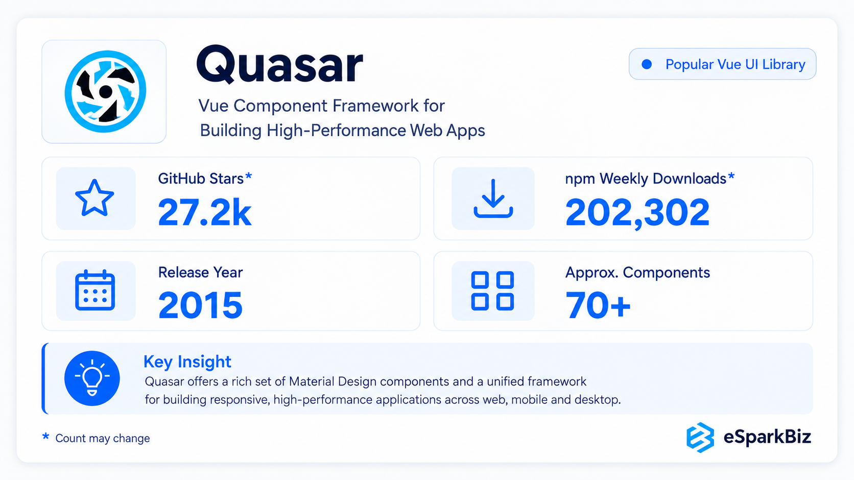
Quasar takes a slightly different approach to a standard UI library, bundling components and app tooling for teams who need to deploy their web, mobile, desktop, SSR or PWA solutions across multiple platforms. Thus, users don’t have to duplicate effort and spend time setting up different development teams for each platform.
Key Features
- Multi-platform application development
- TypeScript support
- SSR, SSG and PWA support
- Integrated Quasar CLI
Ideal For
- Web, mobile, and desktop from one codebase
- Limited platform-specific resources
- Preference for a full framework
Enterprise Capabilities
- Shared codebase across platforms
- Integrated testing and auditing
- Extensible application architecture
Key Trade-offs
- Full application framework rather than UI-only library
- Multi-platform builds can increase architectural complexity
- Requires adoption of Quasar’s tooling and conventions
5. Naive UI
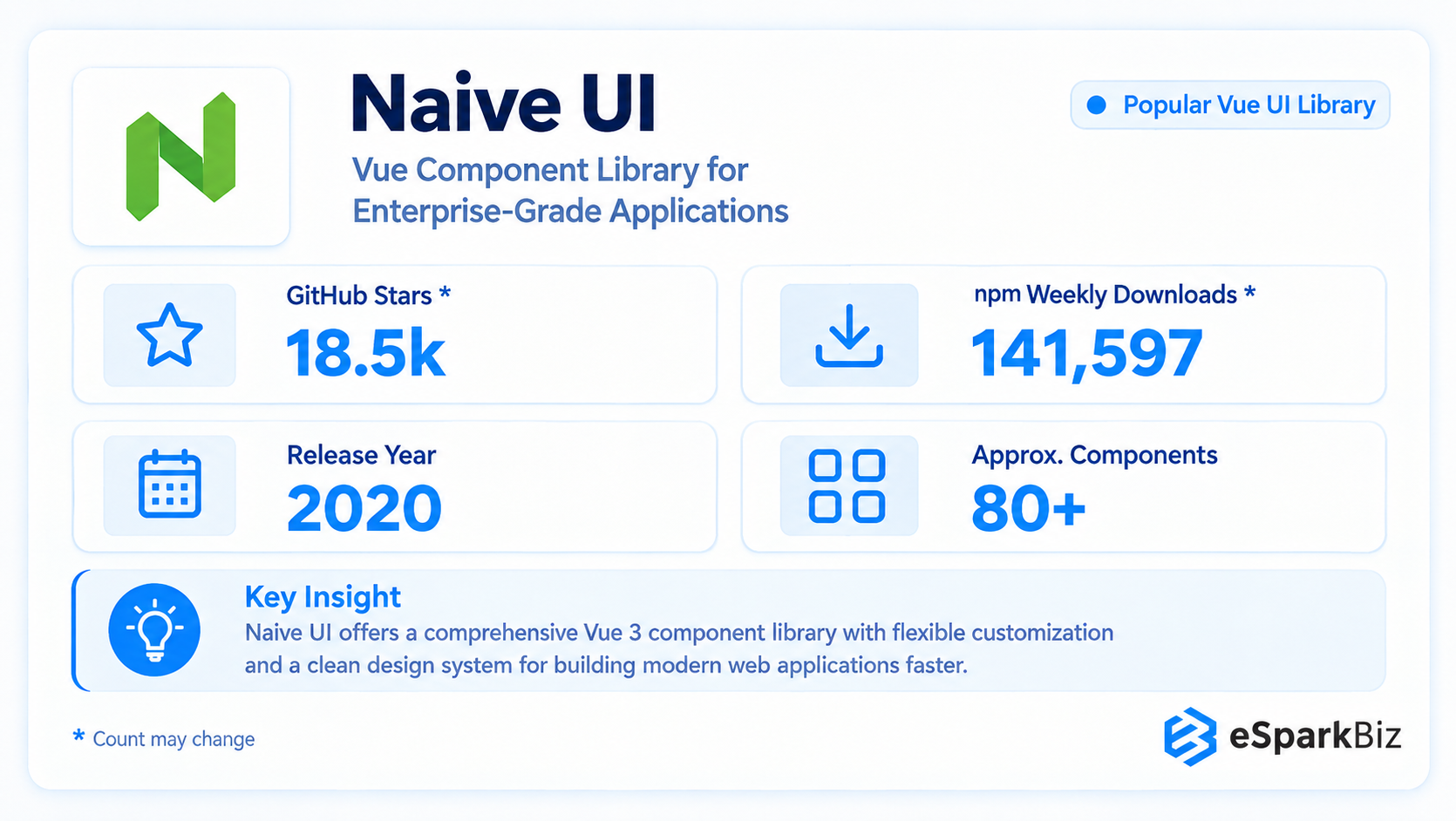
Naive UI is all about giving teams control with its TypeScript-first approach and theme customization. It’s a great choice for those who need a lightweight component set with robust TypeScript capabilities, so developer teams can get to work and create top notch apps without hassle.
Key Features
- Modern component design
- Theme customization
- Lightweight approach
- Developer friendly configuration
Ideal For
- TypeScript-first development
- Lightweight application builds
- Flexible theme customization
Key Enterprise Benefits
- Flexible
- Modern visual approach
- Strong developer experience
Enterprise Considerations
- Smaller ecosystem than major enterprise libraries
- Less organizational familiarity than older alternatives
6. Ant Design Vue
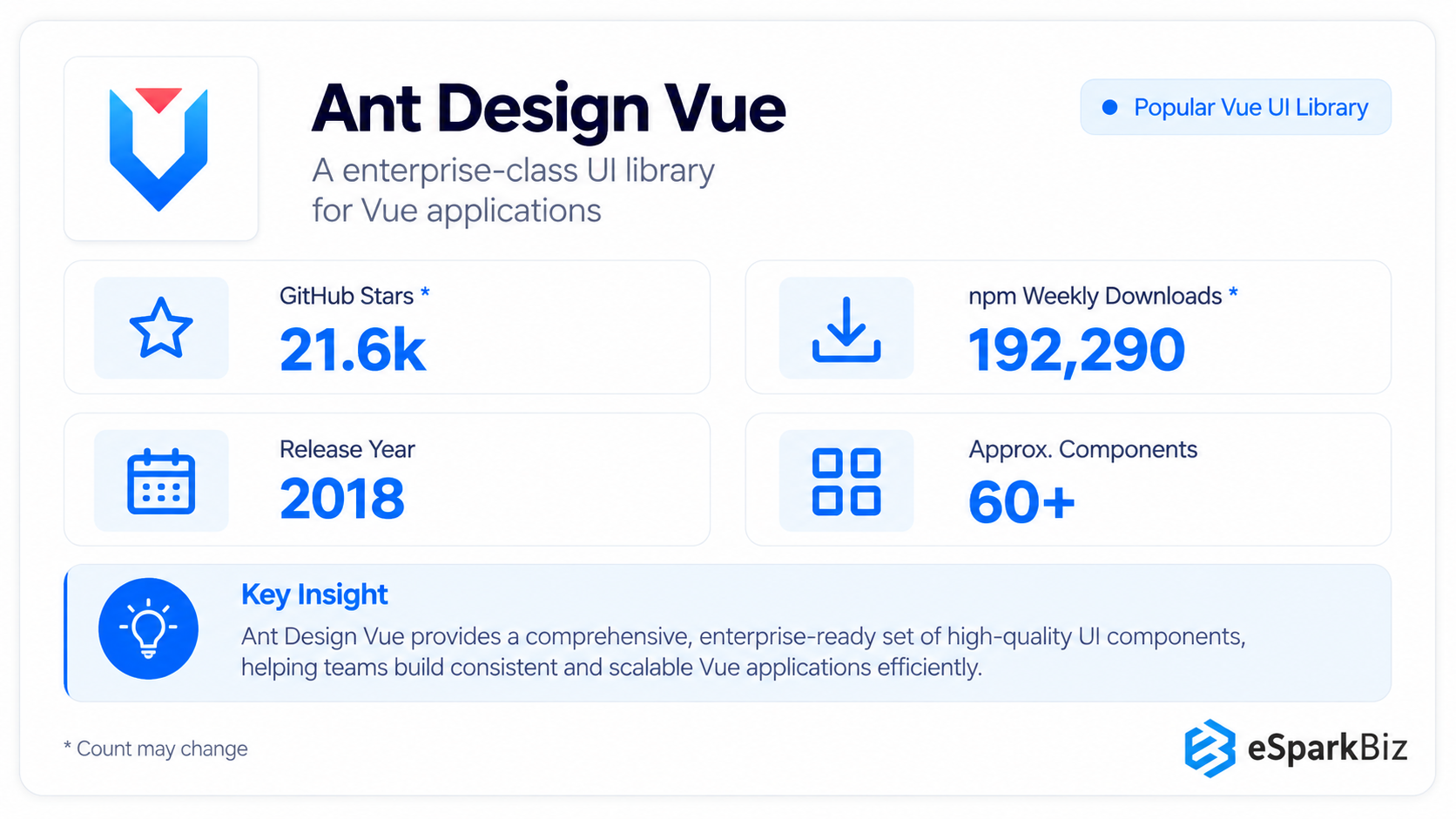
Ant Design Vue is a very structured design system that’s been widely adopted by a lot of companies for their internal applications and admin systems. It’s all about consistency and professionalism it’s a solid choice for teams who want to create an internal platform that values consistency above all else.
Key Features
- Structured enterprise design system
- Large component collection
- Consistent design patterns
Ideal For
- Consistent UI across multiple products
- Structured, standardized interfaces
- Professional design with minimal customization
Enterprise Advantages
- Strong design consistency
- Extensive component ecosystem
- Good enterprise interface fit
Key Considerations
- Opinionated design language
- Restrictive for highly customized branding
7. TDesign Vue Next
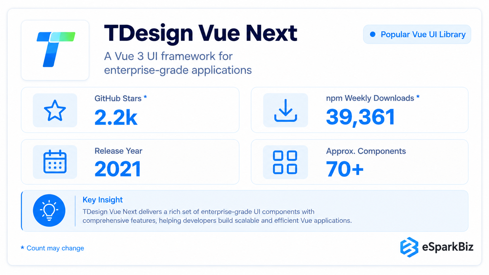 TDesign Vue Next is a dependable component set aimed at business applications that need to make a good impression with their structure & visual consistency. If a team wants a steadily supported corporate-backed library, even if it doesn’t have the same level of community engagement as some of the bigger players it’s a good fit.
Key Features
- Structured design system
- Business oriented components
- Multi framework ecosystem
Ideal For
- Desktop business applications
- Large scale platforms
- Multi framework environments
Enterprise Capabilities
- Consistent design system
- Established roadmap
- Strong ecosystem integration
Adoption Considerations
- Smaller reach in some Western markets
- Requires familiarity with TDesign
Did you know?
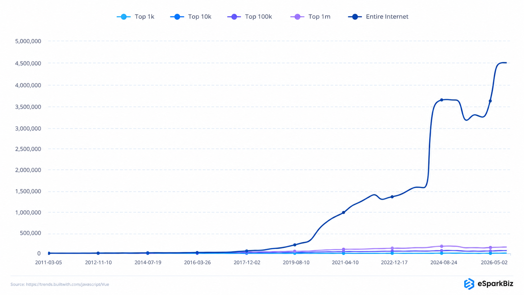
Vue.js currently runs more than 4,522,002 websites tracked by BuiltWith, proving that this lightweight framework is steadily making its way to modern web development.
8. Shadcn UI Vue
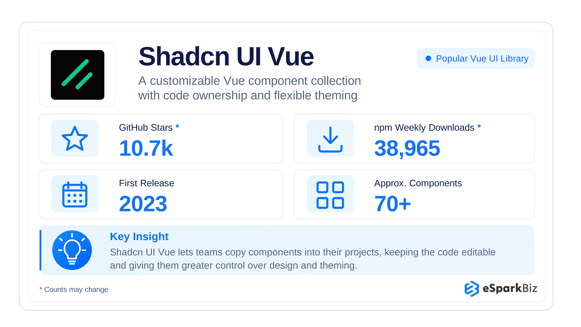 Shadcn UI Vue is a Vue port of the widely used shadcn/ui, built on a different model. Components are added directly to the project’s codebase instead of installed as a package, giving teams full ownership. It suits organizations that value design control and want to avoid a library’s default styling limits.
Key Features
- Components added directly to the codebase
- Built on Reka UI and Tailwind CSS
- CLI for adding components
- Theming through CSS variables
Ideal For
- Custom design systems
- Teams that want full code ownership
- Tailwind-first projects
Enterprise strengths
- Complete control over the code
- Accessible by default
- Free and open source
Considerations
- Teams maintain the copied code
- Updates are manual
- Smaller component set than larger libraries
9. Arco Design Vue
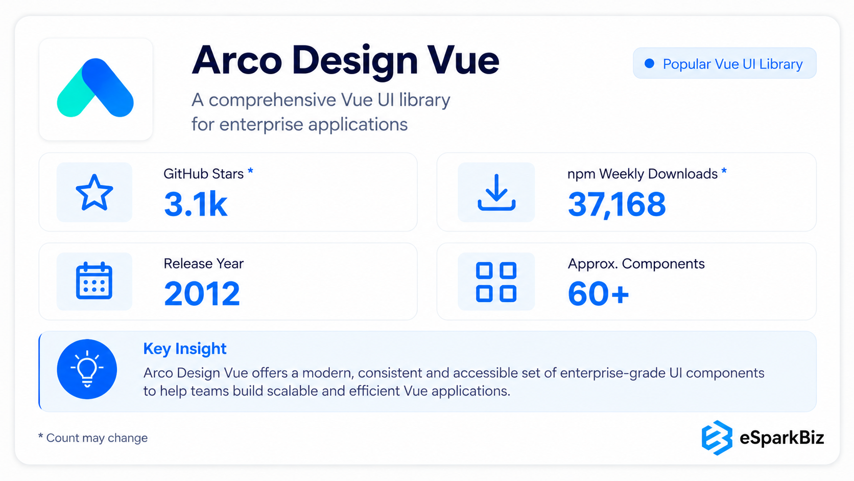
Arco Design Vue gives you a refined, structured component set that’s perfect for internal dashboards and data-heavy business applications. It’s not maybe as well-known outside certain markets, but it’s got solid engineering quality and it’s got a distinct design language that might be appealing to teams.
Key Features
- Structured design system
- Theme management
- Design token approach
Ideal For
- SaaS platforms
- Enterprise dashboards
- Internal admin systems
Enterprise Advantages
- Structured component foundation
- Theme flexibility
- Strong TypeScript support
Key Considerations
- Less broadly adopted in some Western markets
- Ecosystem familiarity varies
10. Reka UI
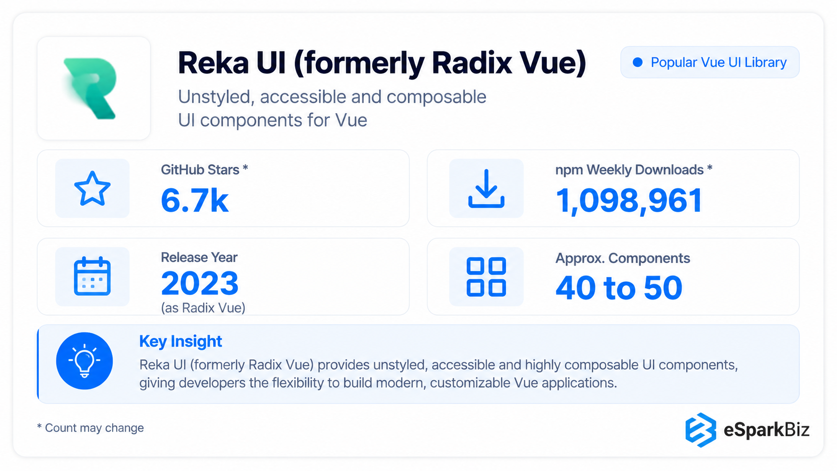 Reka UI provides accessible, unstyled building blocks, giving teams complete ownership over how their product ultimately looks and feels visually. It works well as a foundation for organizations building a custom design language, where brand consistency matters more than quick setup.
Key Features
- Accessible component primitives
- Custom design system foundation
- Behavioral components
- High visual flexibility
Ideal For
- In-house design capabilities
- Full control over component styling
- Distinctive brand experiences
Enterprise strengths
- Maximum appearance control
- Accessibility focused primitives
- Custom system foundation
Considerations
- No predefined styling
- Requires frontend effort
- Better suited to mature teams
Also worth a look
Additional four names suggested by buyers:
- Shadcn-vue offers you editable component code.
- Nuxt UI is for Nuxt applications.
- Vuestic UI offers you a wide and ready-made component library.
- Vant is used for mobile applications.
However, they do not substitute the previously mentioned libraries but have their own area of application.
What are Developers saying on Reddit about Vue Component Libraries?
Reddit discussions provide practical adoption signals, highlighting developer experiences with Vue component libraries across usability, flexibility, component coverage and ecosystem maturity. These perspectives complement our enterprise evaluation without replacing considerations such as maintainability, accessibility, support and scalability.
Planning a Vue 2 to Vue 3 Migration: Timeline and Common Pitfalls
Vue 2 is officially end-of-life at 31st of December 2023, meaning it does not get any official security updates from the developers. This makes migration necessary, not an option anymore.
For a mid-sized app, this whole process can take anywhere from 2 to 5 months and it’s a big deal doing audits on dependencies, testing for compatibility, updating UI libraries, re-working the core of app and then making sure it all still works as it should.
Some of the most common problems people run into when migrating include
- Component library lock-in – discovering late that the current UI library has no Vue 3 equivalent
- End up skipping the compatibility testing which means not able to catch those breaking changes or those shifts in lifecycle hooks
- Underestimate testing need – reactivity changes in Vue 3 can cause problems that only show up when you’re really hitting the app hard
- Combining migration with a redesign – this just multiplies the risk and makes it that much harder to figure out what’s going on and when
The best way to minimise problems and get back to normal speed is to do a phased rollout with proper testing.
How eSparkBiz increased the Vue.js Performance by 30% for One of their Clients
A fast-growing company hired the services of eSparkBiz to optimize their Vue.js architecture as well as develop an architecture that would allow them to easily scale up and introduce new products in the future.
| Area | Case Study Details |
| Technology | Vue.js, reusable components, responsive architecture |
| Scope of Project | 25+ reusable UI components |
| Problem Solved | Problems related to UI architecture and slow delivery of features |
| Performance Focus | 30% increase in frontend performance |
| Objective | Develop a scalable and maintainable Vue.js architecture |
eSparkBiz developed more than 25 reusable components to organize the chaotic UI architecture and worked on trimming unnecessary renderings in order to speed up the frontend process. The architecture was designed to scale easily as the company grows and now makes it easier for the client’s team to maintain.
For similar projects, check out eSparkBiz’s portfolio.
Choosing the Best Vue Component Library for Your Project
Choosing the best Vue component library requires evaluating application requirements, architecture, customization, scalability, team expertise, and long-term maintenance rather than relying solely on GitHub stars or popularity.
| Project Requirement | Best Vue Component Libraries | Reasoning |
| Enterprise dashboards | PrimeVue, Shadcn UI Vue, Element Plus | Offers tables, forms, filters, and business-focused components |
| Material Design interfaces | Vuetify, Quasar | Provides mature Material Design components and consistent UI patterns |
| Custom design systems | Reka UI, Naive UI, Arco Design Vue | Offers greater control over styling, component behavior, and theming |
| Web and mobile applications | Quasar, TDesign Vue Next | Supports shared UI patterns across multiple platforms |
| Accessibility requirements | PrimeVue, Shadcn UI Vue, Reka UI | Provides accessibility features, ARIA support, or flexible building blocks for accessible interfaces |
Vuetify, PrimeVue, and Quasar have established track records, but compare their release cadence, latest major-version dates, Vue 3 compatibility, and maintenance activity before making a long-term decision.
Build or Buy: Component Library Adoption or Internal Design System Building
The choice between buying from a third party or building in-house is not the same for all enterprises and depends on how distinctive the product is, as well as on the team and its goals related to design.
| Factor | Favors Buying | Favors Building |
| Time constraint | Urgency and necessity for fast delivery | Enough time to make targeted investments |
| Brand differentiation | Acceptability of common UI patterns | UI is an integral part of product differentiation |
| Team size | Small or mid-size teams | Large team responsible for design systems |
| Design system ownership | Comfortable with external dependency | Wants full control and IP ownership |
For most enterprises, purchasing results in faster delivery without compromising on the quality, while developing in-house makes sense when the UI is a true competitive advantage.
eSparkBiz helps product teams build software with clearly defined scopes, reusable components, scalable architecture, and measurable outcomes. With 400+ engineers, NDA-protected engagements, full code and IP ownership, and responses to new enquiries within 24 hours, eSparkBiz supports US product teams developing and maintaining reliable software.
Enterprise Governance Questions
| Governance Area | Enterprise Question |
| Ownership | Who owns the component library after approval? |
| Versioning | Who has authority to upgrade the library? |
| Accessibility | Who verifies accessibility needs before release? |
| Library sprawl | How does enterprise avoid adoption of multiple libraries? |
When Should Business Avoid a Component Library Altogether
Component libraries aren’t a one-size fits all solution – in certain product contexts they can actually slow you down more than speed you up and enterprises need to be aware of these cases from the get-go.
When Performance is the Bottom Line
In cases of trading applications in real time, where every additional kilobyte means increased loading time within a complete library, the result is simply an increase in loading time and a reduction in the speed of the application & for companies those milliseconds genuinely make a difference.
The UI is highly proprietary
Products where the interface design is the whole point of the product
- Trading platforms
- Creative and design tools that have to deliver on a brand promise
- Data visualisation products where every infographic has to tell a story
When Customisation Goes Off the Rails
Excessive customization can make building components from scratch more practical than overriding library defaults. Avoid mixing libraries, over-customizing themes, relying on GitHub stars, neglecting upgrades, or skipping accessibility checks.
Extend existing components using slots and theme tokens, create reusable wrappers like AppDataTable for consistency, and build on accessible primitives like Reka UI only when necessary.
Long term dependency risk is unacceptable
Regulated industries that can’t afford to wait for third-party libraries to catch up may just prefer to have control over their own code.
- Single-maintainer projects raise succession risk
- Community libraries may lag on security patches
- In-house code keeps patching fully controlled
In these scenarios, a headless approach or fully custom build typically serves the enterprise better than any pre-styled library, regardless of ecosystem maturity.
Frequently Asked Questions
What are the best enterprise component libraries for a large enterprise application containing hundreds of thousands of screens?
PrimeVue or Vuetify are options that might work well. Both libraries offer a scalable design system with active maintenance and extensive documentation, which support large teams working with many screens.
What if the design team wants a unique brand identity outside of the pre-packaged functional identity offered in libraries?
Reka UI or Arco Design Vue covering more styling control and do not enforce a predefined design would be better in this case.
How did eSparkBiz mitigate legacy risk for a client whose Vue 2 admin panel broke due to browser updates?
eSparkBiz migrated the client’s admin panel from Vue 2 to Vue 3 in phases, testing each module and updating its component library while feature development continued, helping reduce migration risks without a full replacement.
What if we had a web, iOS, and Android application that we didn't want to build and maintain three separate applications for?
With Quasar or TDesign Vue Next, web and mobile development can be done with a single codebase.
What did eSparkBiz do for a client who had a messy Vue project using multiple component libraries?
eSparkBiz conducted an audit of the codebase, consolidated everything to a single Vue component library and eliminated a lot of the work that used to be required to maintain the application.
With a small team and no dedicated designer, which library should we use to build our internal admin tool?
In such cases, Naive UI or Element Plus work best since they provide pre-built themes with easy to implement frameworks that don't require in house design resources to look polished.
Can Vue component libraries actually slow our app down if we’re not careful, or is that just a myth?
Yes. Unused components and redundant styling can increase bundles, but libraries with tree shaking support, like Naive UI, can help control the performance of our app.
What are the top Vue.js development companies for large scale business critical projects?
eSparkBiz, Sombra and Polcode are reputable companies in this space that have successfully delivered Vue.js development and efficient migrations as well as improvements to growing business performance.
Which is better for a large admin app: PrimeVue, Vuetify, or Quasar?
PrimeVue suits data-heavy admin apps with tables and forms. Vuetify fits teams preferring Material Design, while Quasar works best when projects require web, mobile, and desktop builds.
Which Vue component library works best with Tailwind?
PrimeVue’s unstyled mode and Reka UI pair well with Tailwind, and Shadcn UI Vue is built on it. Vuetify works too, but needs extra setup.


 August 20, 2026